Creative round-up April 2020
A selection of design and branding news items that have caught our eye over the last month…
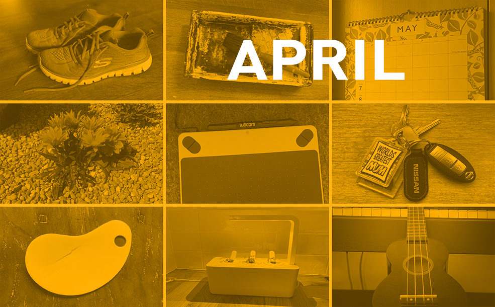
Atlas of Everyday Objects – In the Age of Global Social Isolation
Parsons School of Design in New York has launched a fascinating project to document the objects of our collective isolation. People are invited to share a photo of 9 objects in a 3×3 grid, whose meaning has changed during lockdown, and share it on social media with hashtag #objectsofmyisolation. We love the idea of creating a collaborative archive documenting the current global situation, not only because it will give snapshots of individuals through the objects they choose, but the fact that certain objects recur repeatedly, demonstrating the new significance they have acquired as a result of the virus.
Poster power
Jefferson Hack, co-founder of Dazed Media, speaks of the “long history of political protest and creative resistance being expressed through poster design, illustration and graphic art.” Dazed have teamed up with some big names from the art, design, fashion and music worlds in the #AloneTogether poster campaign, creating original artworks for a prize draw to raise funds for frontline staff at Barts Health NHS Trust. The brief was “to inspire and imagine the possibility of new worlds, explore humanity in the present climate and demonstrate the power of art as a medium for political messages”.
Earth Day on 22 April was celebrated by designers across the world with a series of posters protesting climate change and driving political action. The #MateActNow campaign was initiated by New Zealand-based designer, Chris Flack, and features 100 posters from the likes of Pentagram, DesignStudio and Grafik. Designs range from simple handwritten messages to photography overlaid with text and graphic design, and from solemn black and white pieces through to colourful patterns and bold type.
Festival titles created over Zoom
Creative festival, Playgrounds, commissioned Dutch motion designer Erwin Van Den Ijssel to create the titles for this year’s festival. The event itself had to be moved online due to the crisis, its mission being to provide a sense of community and inspiration for designers working from home.
Erwin’s aim was to make the project collaborative and a “tribute to working from home, together”. Using a clever combination of online grids of webcam views from Zoom, together with traditional stop motion animation, the titles were created over a three week period, and consist of 962 stills which were printed and distributed to 22 participants who pop up throughout the titles holding up their collection of frames. The final results are an impressive testament to creativity in challenging conditions and an innovative use of Zoom!
Hande branding
A new hand sanitiser brand has been set up in south London by knitwear brand Country of Origin, with identity by IYA Studio. 30% of the organic product, which adheres to a WHO formula, is being given to care homes and food banks plus a percentage of the profits, and living wage jobs have been created for people in the local community. IYA creative director, Matt Cottis, says they wanted to create a “playful take on hand sanitisation that was approachable and friendly”. Illustrations are a prominent aspect of the branding, the logotype, Recoleta, gives it a handcrafted feel and muted blues and lilacs make it friendly and appealing. One of many great initiatives to emerge during these challenging times.
Nissan and Cadbury rebrand
Nissan have filed a trademark application for a 2-d monochrome update of their existing logo. It reduces the circle and rectangle that comprise the current logo to stylised lines enclosing the Nissan logotype which has a reduced weight and elongated font. Nissan have not confirmed if the new logo will definitely be used but if it is, they will be following a trend for simpler, flatter, more minimal rebranding already employed by the likes of VW, BMW and Mastercard, and which is better suited to digital applications.
Cadbury’s also have a new look to be released in the UK in 2021. It is the classic British brand’s first image revamp in 50 years, created by design studio Bulletproof. Again, it has a cleaner, more modern look and feel reflecting the fact that digital is forcing brands to pare back imagery and hone in on what is important. The Cadbury name is more refined and elegant, the ‘glass and a half’ icon has a square of chocolate added, putting the product centre stage, and the Dairy Milk logotype has a bolder typeface adding simplicity and confidence to the overall look.
New RBS £20 note
RBS have just launched a beautiful new £20 note developed by Nile, O Street and De La Rue in collaboration with other creative agencies. This is the third in their Fabric of Nature series and every aspect of the design represents something meaningful to the people of Scotland. The £5 note was released in 2016 featuring a mackerel which represents sea, £10 in 2017 with otters representing coast and the new £20 is illustrated with red squirrels to represent forest, as well as a pattern featuring midges that is visible under UV light. All notes depict women from Scotland’s past, with entrepreneur and patron Kate Cranston on the new £20.
Most logos last for 10-15 years but bank notes are around for a lot longer and communicate to a huge audience. Depth of story, intricate detail and multiple layers of meaning are therefore really important.
Creative challenges
Lockdown is generating some innovative ideas to keep our minds busy:
Have you tried the Guardian’s Great British Art Quiz? Daily questions are set by museums, galleries and heritage sites closed due to coronavirus. The quiz is run in collaboration with ArtUK, the online home for UK art collections, showing art from 3000 venues and 45,000 artists. Each day a different institution on ArtUK sets questions relating to artworks in its collection.
It’s Nice That is setting a weekly brief to keep creatives happy. Each week, a challenge is set by an artist, designer or illustrator and participants are invited to upload their submissions to Instagram, with favourites appearing on the INT website. Examples of briefs include designing an environmentally friendly piece of junk mail, creating an image inspired by a scene from your favourite film or TV show and producing an illustration of an unfortunate event in daily life, giving it a humorous spin.
Isolation reading
Modern Heraldry Vol 2 published by Counter-Print explores why designers still use ancient branding techniques. Going back to the 12th century, heraldry was a form of visual communication, for example a coat of arms, enabling individuals to identify themselves as belonging to a particular family or group and to showcase heroic achievements. The book explores how the design world continues to borrow from heraldry with crests, stamps, seals and shields frequently appearing in modern branding. Combined with sleek modern techniques, traditional heraldry provides inspiration for brands wanting to convey respectability and dependability.
Sunday Best – A Celebration of Diversity by documentary photographer, Kate Waggett and published by Hoxton Mini Press, is a photographic celebration of London’s many religions focusing on what unites rather than divides us. Filled with stunning images of people leaving their places of worship dressed in outfits that celebrate their ethnic and cultural backgrounds, together with personal narratives, the book helps provide an alternative narrative to negative stereotypes depicted in the media.