Creative round-up January 2021
A selection of design and branding news items that have caught our eye over the last month…
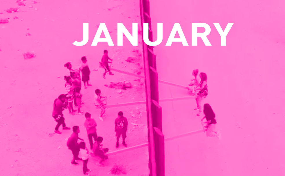
Seesaws on US-Mexico border named Design of the Year 2020
A seesaw installation for kids on the US-Mexico border wall has been announced winner of the Design Museum’s prestigious Design of the Year Award. Called the Teeter-Totter Wall and designed by California-based architect studio Rael San Fratello, the bright pink seesaws allow children to connect and play together on both sides of the border. The award was announced in the same week that Donald Trump, who vowed to complete the wall, left office. Its creators hope the work will encourage people to build bridges between communities and act as an ‘example for how we come together, to create balance and equality’. Inspiring and ingenious – we love this!
CIA new logo and website
In another of the big rebrands for 2021 the CIA, US international intelligence-gathering organisation hopes to diversify its recruitment base. A new monochrome logo features the CIA acronym on a background of fractal lines and couldn’t be more different from the previous traditional eagle-based emblem. The new website is also clean, bold and striking in its simplicity. The agency is seeking to encourage younger, more diverse applicants. However, with the new logo being likened to techno music posters and widely mocked on social media for being ‘too trendy’, have they perhaps gone a bit too far?
Burger King rebrands
In its first rebrand for 20 years, Burger King has a new visual identity designed by creative agency Jones, Knowles, Ritchie. The new logo, a simplified, flat design with the words Burger King sandwiched between bun halves, is inspired by the brand’s original logo. A new custom typeface, Flame Sans and revised, warmer colour palette are to be used across food packaging, merchandising, menu boards, restaurant signage and redesigned uniforms. As Raphael Abreu, Head of Design states: ‘Design is one of the most essential tools we have for communicating who we are and what we value…’ We couldn’t agree more!
Greta Thunberg on Swedish postal stamp
The environmental activist turned 18 on January 3 and is featured on a new Swedish postal stamp in recognition of her work to preserve Sweden’s unique nature for future generations. The stamp, depicting her standing on a cliff wearing a yellow raincoat with swifts flying round her, is part of a set by artist and illustrator Henning Trollbäck entitled Valuable Nature. Other stamps in the series illustrate some of the environmental quality goals drawn up by the Swedish government and include beautiful illustrations of high mountains and flora, a forest, biodiverse bog and endangered green-spotted toad.
London Design Biennale
The London Design Biennale was postponed last year due to the pandemic but the organisers put out an open call to the world’s designers for entries that showcase Design in an Age of Crisis. Addressing any of the four identified topics of environment, health, work and society, the open call was not a competition, but rather a launchpad for ideas and conversations. 500 submissions from over 50 countries can now be viewed in an online gallery www.londondesignbiennale.com/design-age-crisis-gallery and include an incredible range and diversity of radical design thinking – from pop-up ecosystems that can be attached to the side of buildings, projects to turn dark alleyways into safe and creative public spaces, musical instruments made from waste materials and shelter systems for displaced peoples after disaster strikes. These amazing ideas demonstrate that the virus may have changed our lives but it has done nothing to curb our creativity!
Pfizer new logo
The Pfizer–BioNTech Covid-19 vaccine was the first to be authorised by UK regulators and is being rolled out across the population. In its first major rebrand for 70 years by Brooklyn-based design agency, Team, Pzifer’s pill-shaped logo has been replaced with a DNA-like double helix spiral. The new brand identity also includes a fresh typeface and the old eight-colour palette has been stripped down to a clean, clinical two-tone blue colour scheme. Pfizer CEO Albert Bourla describes the new look as a ‘dynamic reflection of our purpose’, shifting the emphasis away from commerce to focus on science and signifying the fact that the company is no longer just ‘treating diseases…we’re curing and preventing them’.