Creative round-up November 2020
A selection of design and branding news items that have caught our eye over the last month…
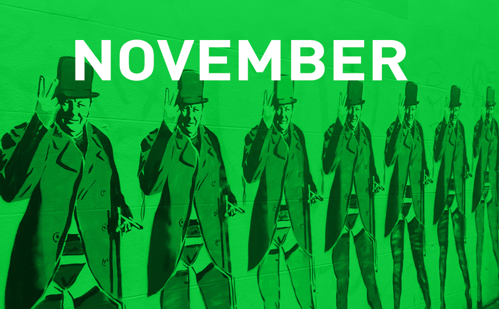
Brighton’s Churchill mural to stay
A rainbow mural in Brighton of seven Winston Churchills wearing stockings and suspenders has been given reprieve after a complaint to the local council looked set to result in its removal. Created by street artist Tom Norris, known as Horace, the mural was part of a series featuring well-known Brightonians and those with links to the city. Churchill went to school in Hove and although his trademark ‘V for Victory’ sign is well known, it was misconstrued in the mural as a swearing gesture. Once the council were informed of its historical significance, the mural was allowed to stay in place. The artist commented that he was surprised the complaint was about the hand gesture rather than the fact that Churchill is clad in multi-coloured lingerie, which he says was partly due to the fact there was no full-length picture to work with, and also intended to match ‘the atmosphere of the city’.
Sony takes over Oxford Circus
In a 48-hour marketing stunt, Sony PlayStation shapes took over Oxford Circus Tube station to mark the PS5 UK launch. Underground signs at the four street level entrances and station walls were rebranded with the iconic shapes found on the PS5’s DualSense controller. This isn’t the first time that Transport for London (TfL) has rebranded Tube stations for corporations. Amazon briefly renamed Westminster to Webminster in 2017 to mark the launch of its London data centre and Canada Water Tube station was also temporarily renamed Buxton Water for the 2015 London Marathon.
Kleenex new product range
London-based studio, Echo, have designed packaging for Kleenex’s new Proactive Care range, a line of personal hygiene products. Moving away from ‘clinical blues’ the range has a fresh green colour palette and illustrations showing interlocking hands, designed to show how Kleenex understands the importance of human touch and that their products can facilitate this safely. The clear typeface with ‘open, approachable and helpful’ descriptions of each product, supplemented with simple icons, is easy to read from a distance and reduces the need to touch items before deciding if they are right. In the context of the coronavirus pandemic, Echo Creative Director, Nigel Ritchie says the branding is designed to shift ‘perceptions from distress purchase to a proactive wellbeing choice’.
Virgin Money rebrand
Virgin Money’s new brand identity adopts a more human persona in line with a general trend among traditional financial institutions. Designed by Pentagram’s Luke Powell, Jody Hudson-Powell and Domenic Lippa, the brand has a fresh new look reflecting Virgin’s core values and a more customer-focused approach to banking. Key features of the new bespoke wordmark are the M of Money with its distinctive loop, together with Virgin logo embedded in the O. There is also a brand new typeface employing a mixture of loops, curves, hard edges and angles. Using the instantly recognisable Virgin red as the primary colour, alongside a secondary palette of bright blue, purple and white, Pentagram says the new identity ‘reflects Virgin Money’s functional and pragmatic side while embodying its people-centred approach’.
Norway has a new passport…
Oslo-based Studio Neue won a competition back in 2014 to design a new Norway passport and after a 6-year development process the finalised versions have been unveiled. Chief considerations were creative and innovative ways of conveying a clear expression of Norweigian identity, together with increased security in order to prevent forgeries. The new passport comes in three colours which reflect the national flag: red for standard; turquoise for the diplomatic passport and white for an emergency passport; plus pale blue for foreign nationals. All have gold lettering and pages inside depict scenes from nature including mountains and forests, with the moon and Northern Lights appearing through use of UV detailing which shifts scenes from day to night. They make our new British passports seem rather dull in comparison…
…and Mississippi has a new flag
Citizens of Mississippi have voted to replace the state’s official flag, which incorporated the confederate symbol, with a design which has the state flower, a magnolia blossom, at its centre. The previous flag was retired in June because of mounting pressure to remove confederate symbols from official places after the death of George Floyd. Mississippi had used the emblem since 1894 and was the only state still to do so after Georgia removed it in 2003.
With a blue background flanked by red and gold bars, the flag incorporates twenty white stars as it is the twentieth state in the union and one gold star signifying the state’s indigenous peoples. Attempts to redesign the flag in recent years had been voted down. The fact it has now gone ahead after 126 years indicates attitudes may finally be changing.