Creative round-up September 2019
A selection of design and branding happenings that have caught our eye over the last month…
iPhone 11 unveiled
September 10 saw the release of the new iPhone 11, after months of speculation over whether the logo would change. With the Apple logo being so iconic, even small adjustments cause a stir amongst fans and it turns out the rumours were true – the logo on the back of the phone has moved from the upper section to a vertically central position and the iPhone branding at the bottom has gone.
The reason for the new design may be the addition of a new dual sensor camera (3 lenses on the Pro and Pro Max models) with square back plate to fit them, which would have looked top-heavy with the traditional branding. The new centred logo and stripped back design adds valuable blank space and visual balance, as well as making the camera the main feature of the otherwise streamlined iPhone.
Whether you like the look or not, it is a reflection of 2019 smartphone culture and the influence of social media, where phones are less communication devices with cameras, than cameras that are also communication devices.
NHS is UK’s most relevant brand
According to the Brand Relevance Index published by Prophet, a brand and marketing consultancy, Apple has been knocked off the top spot as most relevant brand by the NHS, which also beats Spotify, Netflix and SonyPlaystation. The study surveyed 12,200 consumers on 235 brands across 26 industries and attributes the rise of the NHS to the current climate of “uncertainty for UK consumers” and declining trust in globally renowned brands. In contrast, brands with a positive ethos such as Lush, Lego and Ikea are all doing well, with Lush featuring in the top 10 for the first time.
#Share the Orange
Now in its third year, the latest Alzheimers Research UK campaign #Share the Orange, stars Samuel L. Jackson in a film which challenges misconceptions that dementia is an inevitability of old age and highlights the fact that physical diseases, most commonly Alzheimers, cause dementia. The orange symbolises the weight of matter lost in the brain as the condition develops and emphasis is placed on the fact that research can lead to life-changing breakthroughs and cures.
This is a great example of the power of video when used by charities to run innovative and thought-provoking campaigns in order not only to gain support, but to change perceptions.
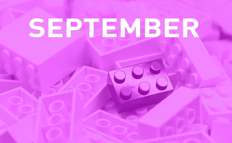
Lego rebrands after 30 years
Leader in the children’s toy market and with film and magazine franchises, it may come as a surprise to learn that it is three decades since Lego last released an ad!
With the tagline “Rebuild the World”, the campaign will run on TV, social media and in a series of posters with Lego scenes which defy convention, such as a school of fish chasing a shark and a car emitting a bouquet of flowers from its exhaust. According to Remi Marcelli, Senior VP of Lego and Head of the Lego Agency, the reasoning behind running the campaign is that “Creative problem-solving skills are needed now more than ever”. With an emphasis on creativity, not just building and construction, the campaign combines fun with a deeper underlying message about improving society which will appeal to children and adults alike.
Minimalist logo design on the decline?
According to recent research by the Journal of Marketing Research, the current trend for minimalist, pared-back logos may be on the decline and descriptive logos representing what a company sells, such as the Burger King hamburger logo, were more successful at building trust with consumers. The study worked with two thousand participants and examined 597 logos to reveal that “logo descriptiveness can positively affect impressions of authenticity” and “significant positive association between logo descriptiveness and gross profit”.
Exceptions to this were where a company is so well known that it doesn’t need to rely on a descriptive logo telling people what it sells, such as the Macdonald’s golden arches and Mastercard’s intersecting circles.
Pantone’s new colours
294 new shades have been added to the Pantone Matching System (PMS), its first update since 2016, bringing the total number of shades to 2,100. The company describes the shades as “trend relevant” with names including “Gen-Z yellow” and “Bisexual lavender”. A swatch book is available of the new colours…or maybe it’s time to get a completely new set of colour guides, which are apparently more reliably printed and accurate than ever before!
Exhibitions
September saw the London Design Festival 2019 celebrating and promoting London as the world’s design capital. Designers, architects and creatives showed off their work in exhibitions and installations across the city including Paul Cocksedge’s Please Be Seated, a large scale sculpture in Broadgate made from scaffolding planks for sitting on or walking under; Camille Walala’s brightly coloured and geometrically patterned Outdoor Living Room in South Molton Street; Lee Broom’s Kaleidoscopia, a giant optical illusion in Shoreditch and a whole range of amazing contemporary design installations at the Victoria and Albert Museum.
Running from 11 September until 9 February 2020 at the Design Museum in London is Beazley Designs of the Year, which looks at innovation across graphic design, fashion, digital, architecture, product and transport from the past 12 months. Well worth a visit if you want to check out the most original and exciting products, concepts and designers across the globe today. According to curator, Beatrice Galilee, designs by and for women and accessible designs are prominent and much of the work constitutes a “rebuke of stereotypical design”. One design from each category as well as an overall winner will be announced on November 21.